PUBLISHING SERIES


BRANDING
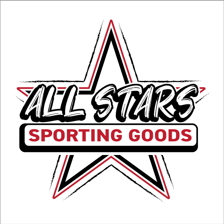
Client’s Name: All Stars Sporting Goods
Intended Audience: The rebranded logo and style guide specifically target the brand’s desire to expand its target audience. They wanted to extend their customer base beyond their existing customers, who are middle-aged men, to include younger adults of all genders, ages ranging from 25-45, and youth in school sports.
Strategy and Concept: The high contrast color palette of white, black, and red represents assertiveness, dominance, passion, and energy to promote the store and products of having power, strength, and endurance. For visual association with sports, I included a star symbol, which is widely recognized within the sports community, as professional teams and sports networks use it. The “All Stars” typography appeals to the younger demographic with its trendy appearance of playfulness while communicating a sense of boldness and assertiveness. The capitalized sans-serif typeface of “Sporting Goods” portrays confidence and consistency that is associated with an athlete’s mindset and appears familiar to all ages due to its boldness and simplicity.
Reason for decisions: Since the client wanted to rebrand themselves to appeal to a more youthful audience while keeping their existing customer base, I chose a color palette, typography, and graphic symbols that are trendy yet consistent with the established sports community.