PREMIUM LIQUIDATOR
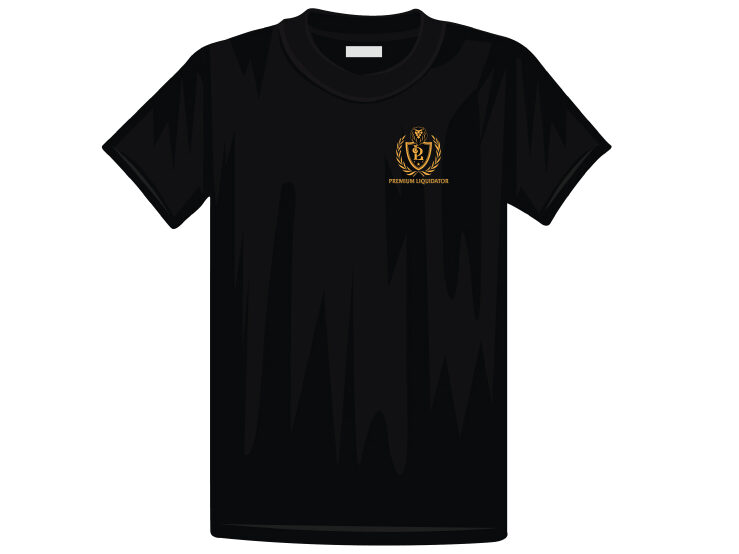
Client’s Name: Premium Liquidator
Intended Audience: Online shoppers who are looking for name-brand products at reduced prices.
Strategy and Concept: The client wanted to incorporate a lion within the logo, so I placed a lion’s head on top of a three-pointed shield that outlined the brand’s initials. I added stars in a V-shaped pattern below the initials to give a triumphant feel, and the whole design is flanked by olive branches. At the bottom, the company name is displayed in a bold decorative font, which anchors the whole design.
Reason for decisions: The lion head was placed at the top to showcase its symbolism of pride, and a shield below it to covey protection, which is the brand’s message of taking pride in their quality products and giving the customer a sense of protection that they are purchasing from a reputable company. The olive branches were added for their symbolism of peace and triumph, which is what the customer feels when they purchase high-priced items at a fraction of the cost. The brand’s name displays assertion and makes a bold statement that conveys to customers that the brand is confident in the merchandise it sells.
MUSIC FESTIVAL

Client’s Name: The Silver Spur Resort
Intended Audience: Adults and youth in the East Texas area who enjoy local country music bands.
Strategy and Concept: Since this festival was accompanied by a BBQ cook-off, I wanted to pay homage to the competition by adding BBQ to the design. Focusing on the music festival, I incorporated music notes and used country-themed typography to convey a fun experience.
Reason for decisions: I like adding hidden messages within designs whenever possible, so when taking a closer look, the viewer will see four meanings in the name. First, the “Q” in the upper left corner is part of the resort’s restaurant name, “The Q & Brew,” which is responsible for hosting the BBQ cook-off portion of the event. Second, I took the “Q” and designed it to look like a BBQ grill with the letters “BB” centered in the middle to give tribute to the BBQ cook-off. Third, “Q The Music” is a play on words to “cue the music,” which is a saying related to music. Lastly, “The Music Festival” is in larger font size to clearly promote the event as a music festival. The colors red, white, and black are the color palette of “The Q & Brew,” and the gold compliments the palette while making a bold statement that the event is a festival.