


ADVERTISEMENT

Client’s Name: The Q & Brew
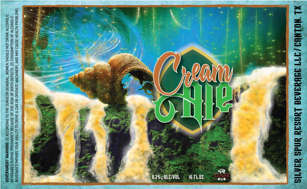
Intended Audience: Adults ranging from 21-50 who enjoy craft beer in the East Texas area.
Strategy and Concept: The designs had to be unique to their respective beers, so I used the beer name and its ingredients as the starting point for each label. The color palettes are different for every design, but to keep a unified look between them all, I chose vivid colors that had high contrast with their darker counterparts. Each label has an additional graphic centered in the middle that displays the name that is outlined with a different shape for each one. In addition, every label has a main image that holds a hierarchy in the background and is designed based on the name and/or ingredients.
Reason for decisions: These labels had individual traits that portrayed their own message, but I needed to choose similar design techniques across them all to keep them as a unified series. The colors, artwork, shapes and layout were the elements that kept them relatable to one another. The overall choices of these dramatic styles were geared toward the target audience’s preference for visual artwork on beer cans.